
Start with the guest approach
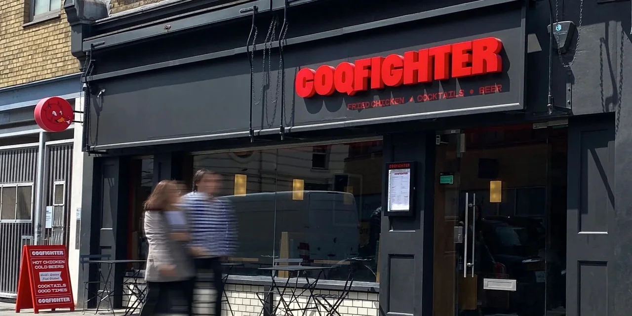
A restaurant sign should make the venue recognizable before the guest reaches the door. The view from across a parking area can be very different from the view along a sidewalk. Photograph both. If the frontage is compact, a short name or distinctive mark may do more useful work than a long descriptor or list of menu items.
Compare the lighting in context
Illumination is part of the visual composition. Send a daytime view and an after-dark view that includes neighboring signs, entrance lights, and the surrounding building. Channel letters and illuminated cabinets create different appearances, and neither should be selected without considering the proportions of the artwork and the available mounting area.
Give the sidewalk a separate thought
A sign mounted flat above a storefront may be clear from the opposite side but less visible to someone walking beside the glass. A projecting face can introduce the business from that angle where the property can accommodate it. Keep its wording concise, and discuss the bracket, attachment, and clearance as part of the physical proposal.
Keep pickup information practical
Dine-in guests, pickup customers, and delivery arrivals may not use the same door. Organize those messages separately from the permanent restaurant name. A main sign can establish the identity while a smaller directional face explains the next step. This avoids using the most prominent part of the frontage for operational instructions that may change.
Carry the character inside
An interior logo or feature display can extend the brand without repeating every exterior detail. Choose the location in relation to seating, reception, or the ordering point. Share finishes and lighting so the indoor piece belongs to the room. The best brief connects the guest experience with the fabrication and installation details from the beginning.