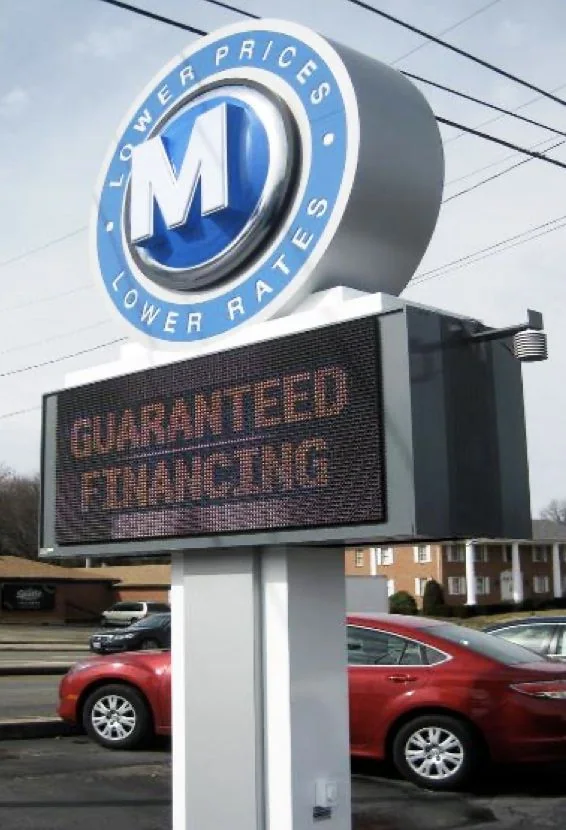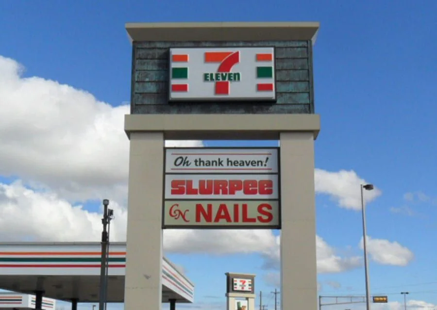
Pylon signs
One structure. A clear destination.
Plan convenience store signs around your Springfield, Tennessee property, from the first view of the name to the final visitor destination.
By sending your request, you agree to be contacted about your project. Read our privacy policy.
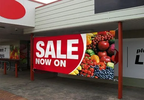
★★★★★5.0Based on 14 reviewsA convenience store has several messages competing for attention: the store name, fuel identity where relevant, and current offers. The permanent sign should make the destination recognizable first. A cabinet or building identity can support that task while temporary graphics carry changing product promotions.
Check the view from the entrance and the parking area before adding more messages. Windows can easily become crowded, especially when several suppliers provide promotional artwork. A deliberate layout gives the main business name room and reserves defined places for short-term campaigns, reducing the need to redesign the frontage for each offer.
Springfield’s historic courthouse square provides a recognizable center for Robertson County. Around a traditional square, neighboring elevations, awnings, and display windows are part of the view. A sign should help a business stand out while still belonging to its own frontage. For properties away from the square, the first useful sign may instead be at a driveway or building entrance.
For convenience store signs near Springfield’s square, include the complete elevation rather than just a cropped sign band. Show the whole storefront, roadside display, and any existing supplier branding.
Bring a full-building photograph rather than only the area where the lettering will sit. Include any awning, roof edge, and adjoining tenants. Those details help determine whether a compact building sign, a projecting face, or a freestanding entrance display deserves the strongest emphasis.