01 / SIGN SOLUTIONS
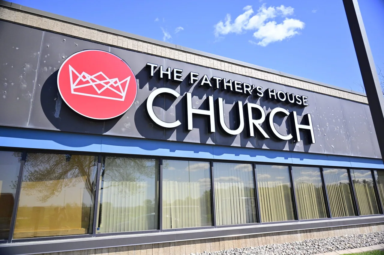
Channel letters
A name with dimension.
A historic Main Street and a different pace beyond downtown.
By sending your request, you agree to be contacted about your project. Read our privacy policy.
★★★★★5.0Based on 14 reviewsFranklin’s historic downtown brings shops, restaurants, and professional services together around a walkable Main Street. A sign viewed between neighboring storefronts has a different job from one introducing a property across a parking area. Start the design conversation with the actual frontage: its windows, doors, brickwork, and the angle from which a first-time visitor sees the business name.
Treat a downtown storefront and a freestanding commercial property as separate design situations. For a smaller frontage, leave enough breathing room around the identity and photograph the view along the sidewalk. For a deeper site, record the entrance sequence from the road to the door. The useful question is where recognition happens, rather than how much lettering can fit on the building.
Explore the product, the planning details, and the questions that help define your project.
A name with dimension.
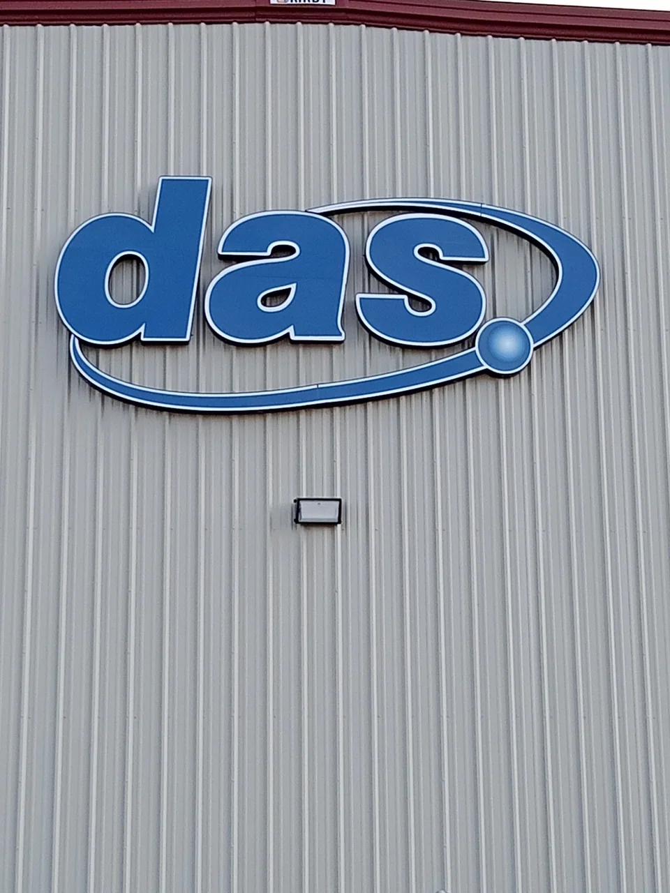
Make the building unmistakably yours.
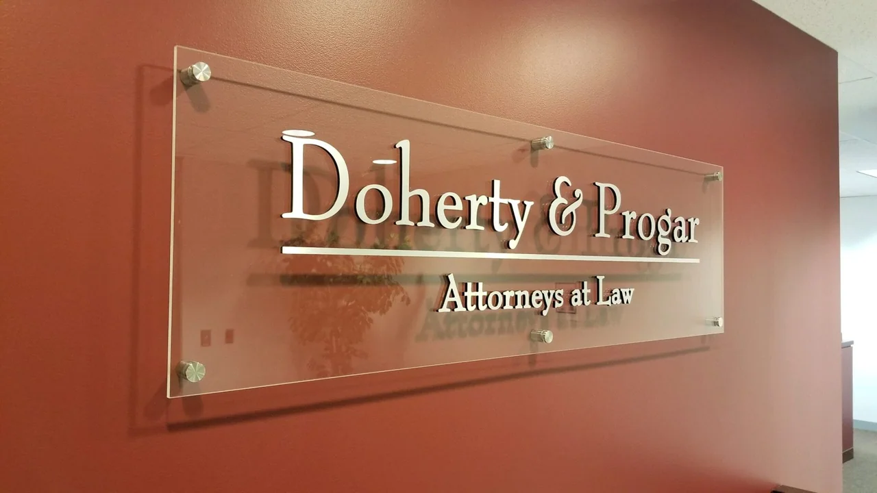
A better welcome. A clearer way through.
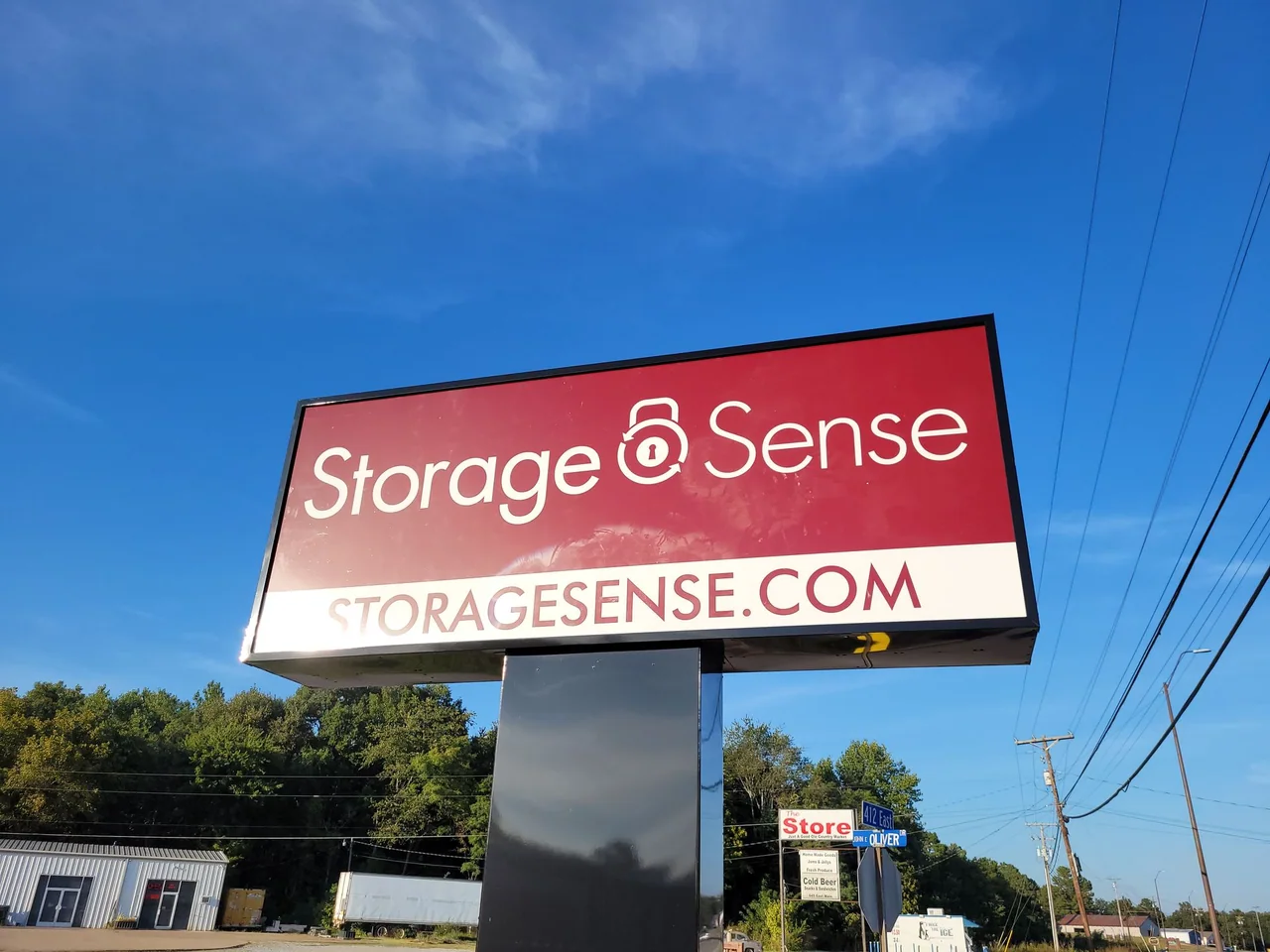
Visibility starts before the front door.
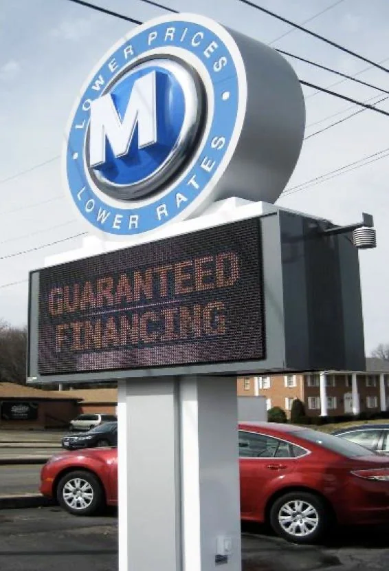
A clear face for your brand.
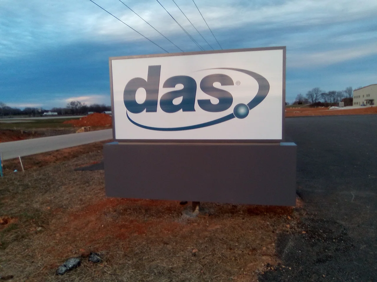
Give the entrance a permanent identity.
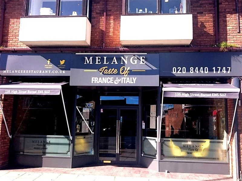
Make your frontage part of the brand.
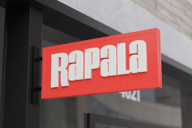
Get noticed along the sidewalk.
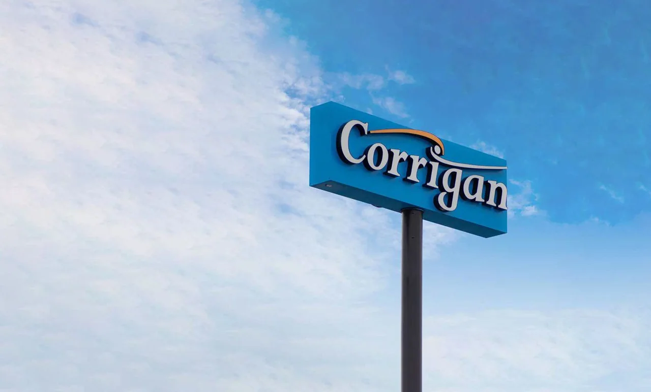
Put your identity in the sightline.
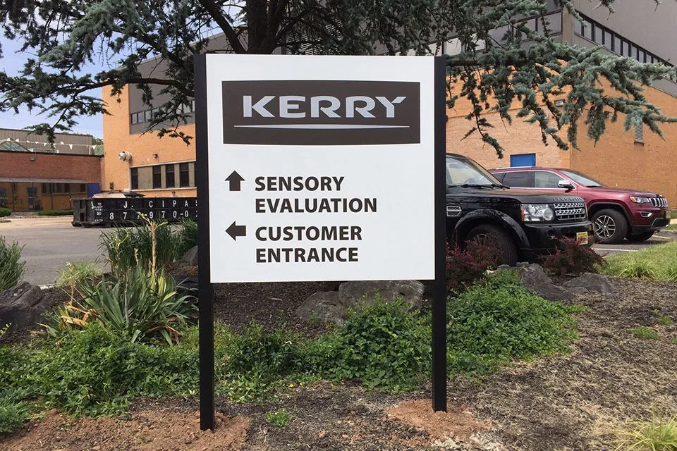
Straightforward signs. Clear information.
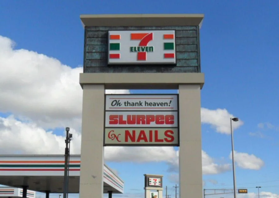
One structure. A clear destination.
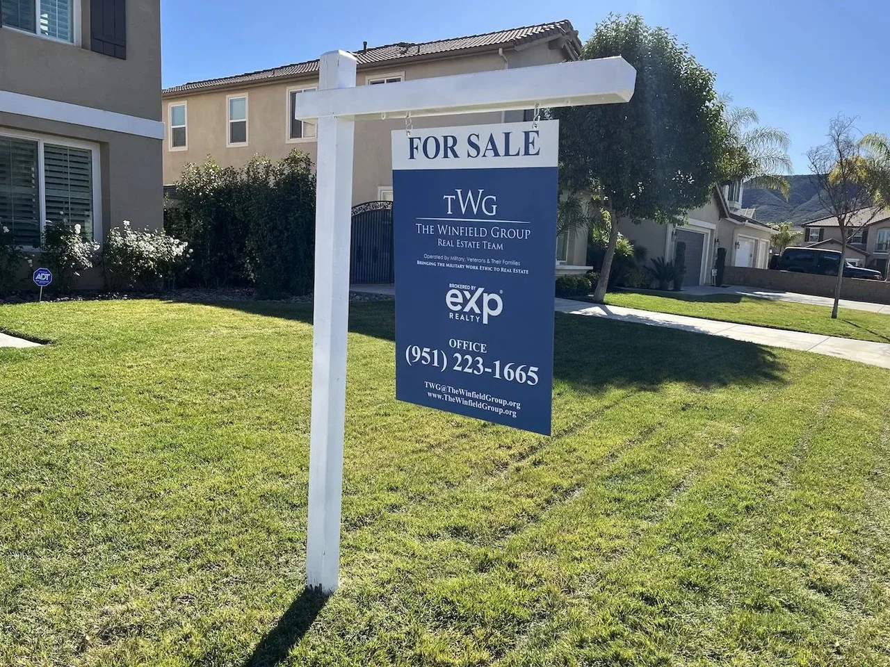
Make the property easy to find.
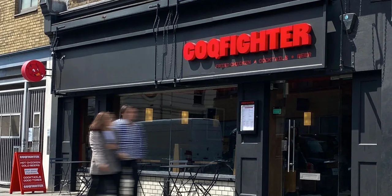
Set the scene before guests step inside.
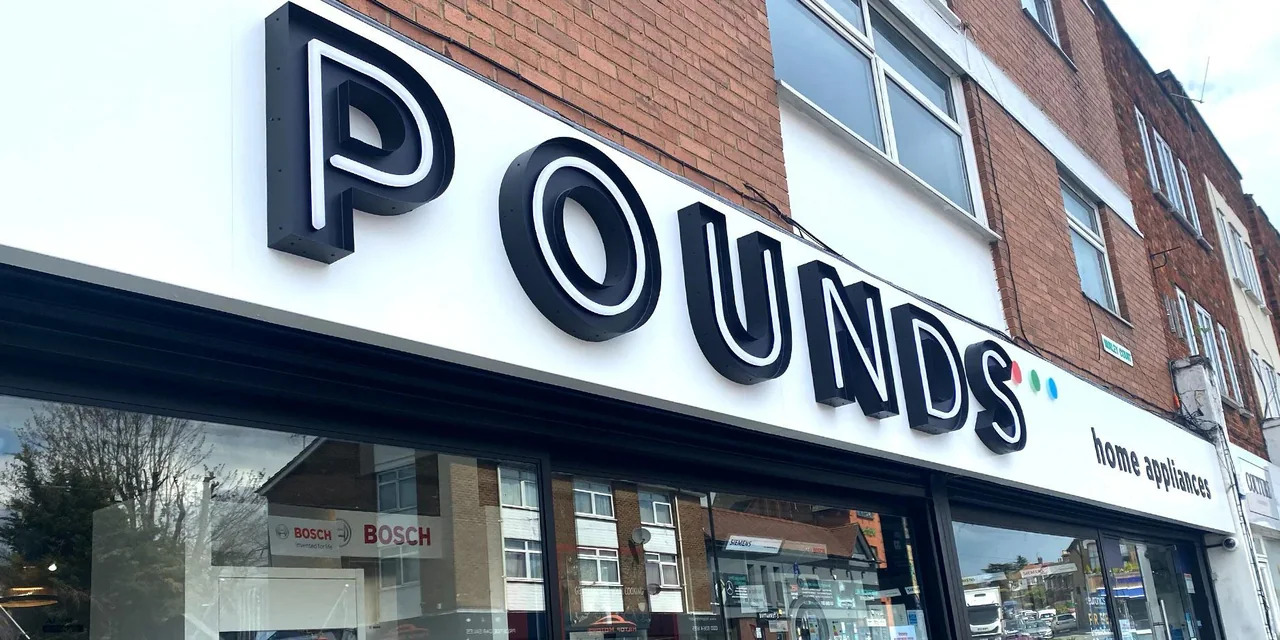
Turn the storefront into an invitation.
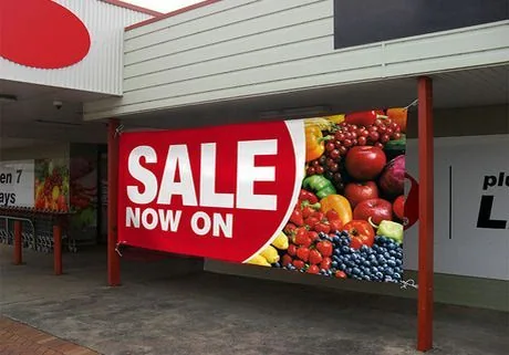
Make the next announcement count.
The final step deserves a proper plan.
Keep your business looking like itself.