Channel letters in The Gulch, Nashville
A name with dimension. Plan a site-specific sign for your The Gulch business with Lee Neon Signs.
Tell us about your project
By sending your request, you agree to be contacted about your project. Read our privacy policy.
★★★★★5.0Based on 14 reviews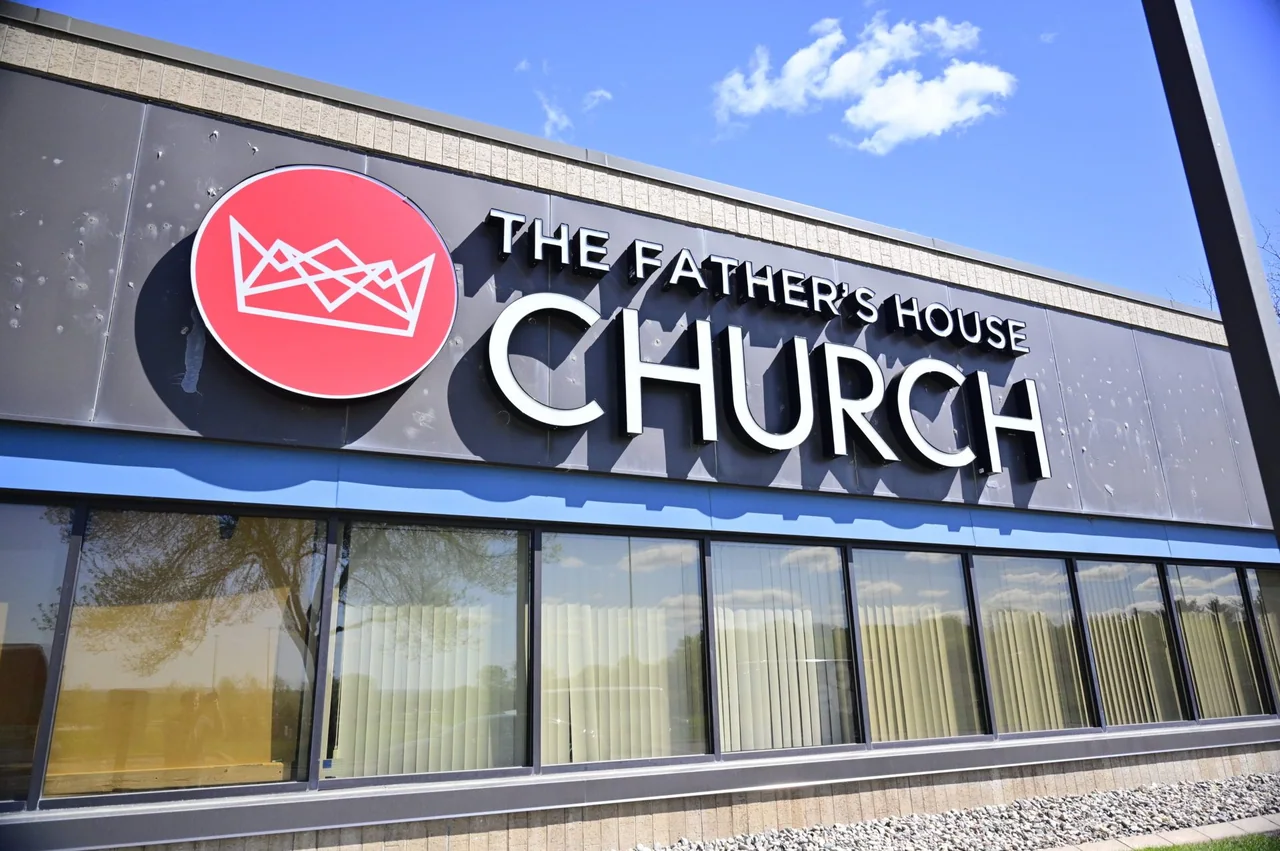
Channel letters & dimensional signs
Give your business name depth, definition, and a place on the building. Lee Neon Signs creates channel letters and dimensional lettering for storefronts, commercial properties, and interior brand displays across Tennessee and Kentucky.
Channel letters are individually formed sign letters that can be illuminated. Dimensional letters offer a raised, architectural finish without necessarily including lighting. The right choice depends on the viewing distance, building surface, opening hours, and character of your brand.
Connect the sign with the place.
The Gulch is a Nashville neighborhood, with restaurants, shops, and urban buildings placing many signs close to the pedestrian route. A face mounted flat above the door may be clear from across the street yet less noticeable to someone walking beside the windows. Compare the straight-on view with both sidewalk approaches before deciding how the name should appear.
At a compact frontage, each surface should have a clear purpose. A projecting identifier can introduce the business from the side, the main facade can confirm its name, and a window can carry a smaller practical message. Keeping those roles distinct helps the entrance remain understandable without filling every pane or repeating the same large logo everywhere.
Start with the site and the message.
For channel letters in The Gulch, consider the shorter street-level viewing angles as well as the view across the frontage. A logo that looks balanced on a screen may become difficult to read when seen obliquely. Share photos along the sidewalk so letter spacing and illumination can be considered in context.
Send a short series of frontage photos, including neighboring doors, brackets, canopies, and the path beside the building. For freestanding sign requests, identify the actual available ground position first. An urban storefront may be better served by building-mounted identification than by a sign structure that the property cannot accommodate.
Options for your project.
Front-lit letters
A clear, illuminated face for business names that need to read after dark.
Halo-lit letters
Light behind the letters creates a softer glow against a suitable mounting surface.
Non-illuminated dimensional letters
Raised metal or acrylic lettering for a precise, architectural identity.