Channel letters in Springfield, Tennessee
A name with dimension. Plan a site-specific sign for your Springfield business with Lee Neon Signs.
Tell us about your project
By sending your request, you agree to be contacted about your project. Read our privacy policy.
★★★★★5.0Based on 14 reviews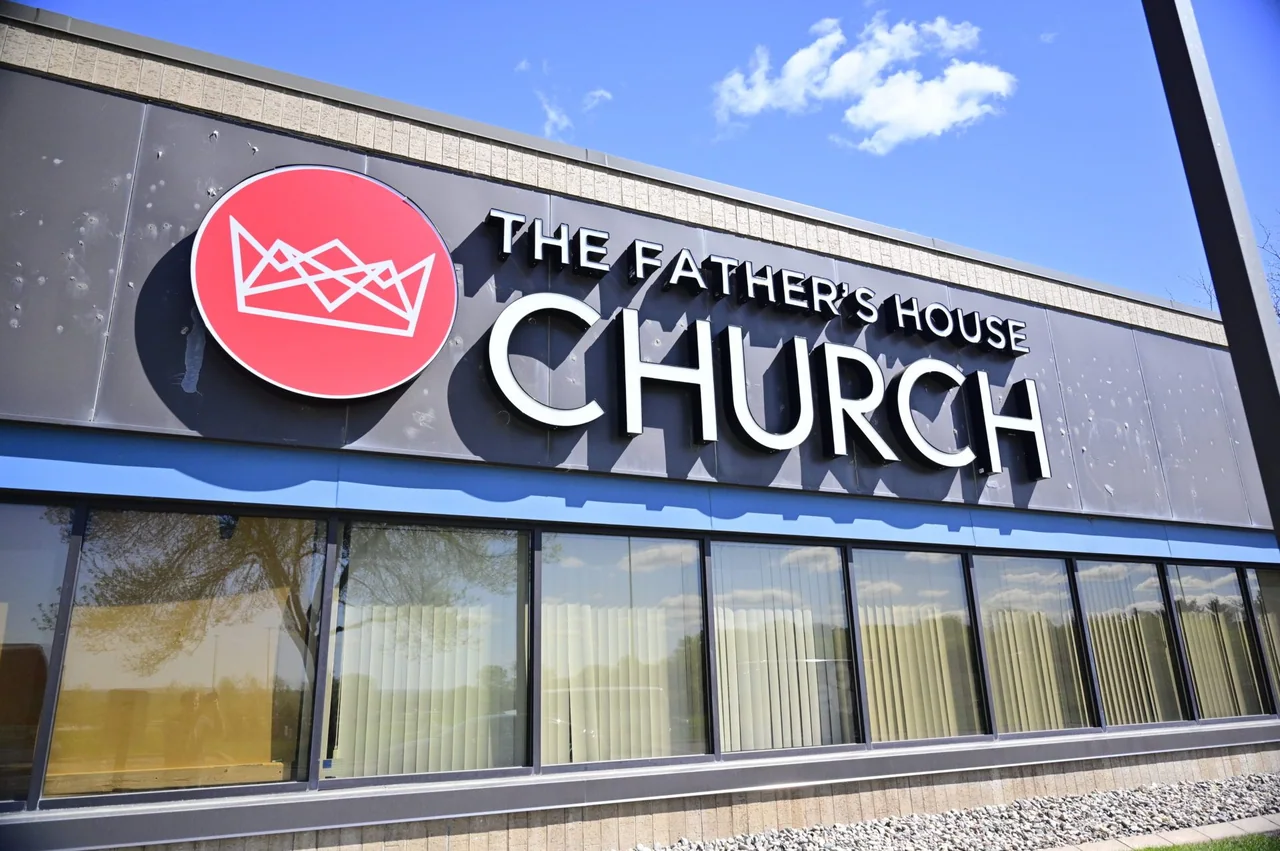
Channel letters & dimensional signs
Give your business name depth, definition, and a place on the building. Lee Neon Signs creates channel letters and dimensional lettering for storefronts, commercial properties, and interior brand displays across Tennessee and Kentucky.
Channel letters are individually formed sign letters that can be illuminated. Dimensional letters offer a raised, architectural finish without necessarily including lighting. The right choice depends on the viewing distance, building surface, opening hours, and character of your brand.
Connect the sign with the place.
Springfield’s historic courthouse square provides a recognizable center for Robertson County. Around a traditional square, neighboring elevations, awnings, and display windows are part of the view. A sign should help a business stand out while still belonging to its own frontage. For properties away from the square, the first useful sign may instead be at a driveway or building entrance.
Use the property’s actual rhythm to shape the package. A narrow shop may need a concise name and clear door identification; a business on a deeper lot may need a staged arrival from entrance to reception. Existing sign faces can be photographed as a complete system so a new panel does not look disconnected from the supports or surrounding architecture.
Start with the site and the message.
For Springfield lettering, begin with the existing sign area and the business name you want visitors to recognize. Individual letters can make a compact sign feel precise, but the wall surface and spacing still matter. Photos of old mounting points or an existing sign band are useful when planning an update.
Bring a full-building photograph rather than only the area where the lettering will sit. Include any awning, roof edge, and adjoining tenants. Those details help determine whether a compact building sign, a projecting face, or a freestanding entrance display deserves the strongest emphasis.
Options for your project.
Front-lit letters
A clear, illuminated face for business names that need to read after dark.
Halo-lit letters
Light behind the letters creates a softer glow against a suitable mounting surface.
Non-illuminated dimensional letters
Raised metal or acrylic lettering for a precise, architectural identity.