Channel letters in Franklin, Tennessee
A name with dimension. Plan a site-specific sign for your Franklin business with Lee Neon Signs.
Tell us about your project
By sending your request, you agree to be contacted about your project. Read our privacy policy.
★★★★★5.0Based on 14 reviews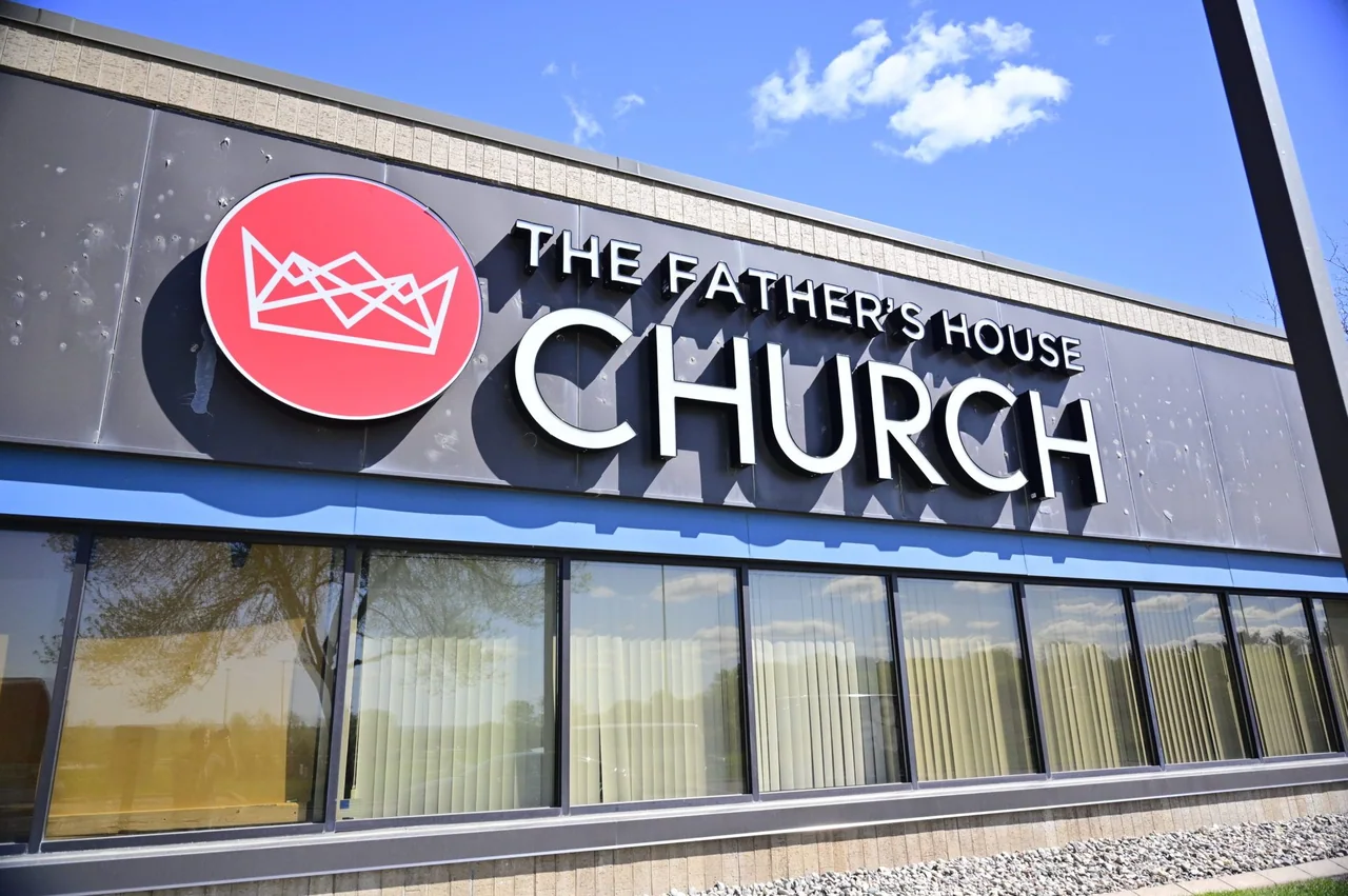
Channel letters & dimensional signs
Give your business name depth, definition, and a place on the building. Lee Neon Signs creates channel letters and dimensional lettering for storefronts, commercial properties, and interior brand displays across Tennessee and Kentucky.
Channel letters are individually formed sign letters that can be illuminated. Dimensional letters offer a raised, architectural finish without necessarily including lighting. The right choice depends on the viewing distance, building surface, opening hours, and character of your brand.
Connect the sign with the place.
Franklin’s historic downtown brings shops, restaurants, and professional services together around a walkable Main Street. A sign viewed between neighboring storefronts has a different job from one introducing a property across a parking area. Start the design conversation with the actual frontage: its windows, doors, brickwork, and the angle from which a first-time visitor sees the business name.
Treat a downtown storefront and a freestanding commercial property as separate design situations. For a smaller frontage, leave enough breathing room around the identity and photograph the view along the sidewalk. For a deeper site, record the entrance sequence from the road to the door. The useful question is where recognition happens, rather than how much lettering can fit on the building.
Start with the site and the message.
For a Franklin frontage where the architecture is part of the business identity, consider how the letter depth and lighting sit against the wall. A compact name on a narrow sign band needs a different layout from a wider commercial facade. Compare a direct-mounted appearance with a raceway approach before finalizing the artwork.
Walk the approach before choosing the sign format. Bring one photograph from the visitor’s first decision point and another from directly outside the entrance. If a property has design criteria, include those documents with the artwork so the proposal responds to the building as well as the brand.
Options for your project.
Front-lit letters
A clear, illuminated face for business names that need to read after dark.
Halo-lit letters
Light behind the letters creates a softer glow against a suitable mounting surface.
Non-illuminated dimensional letters
Raised metal or acrylic lettering for a precise, architectural identity.