Pylon signs
One structure. A clear destination.
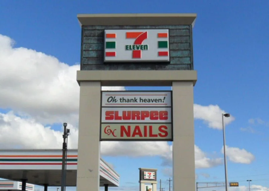
A convenience store has several messages competing for attention: the store name, fuel identity where relevant, and current offers.
By sending your request, you agree to be contacted about your project. Read our privacy policy.
★★★★★5.0Based on 14 reviewsA convenience store has several messages competing for attention: the store name, fuel identity where relevant, and current offers. The permanent sign should make the destination recognizable first. A cabinet or building identity can support that task while temporary graphics carry changing product promotions.
Check the view from the entrance and the parking area before adding more messages. Windows can easily become crowded, especially when several suppliers provide promotional artwork. A deliberate layout gives the main business name room and reserves defined places for short-term campaigns, reducing the need to redesign the frontage for each offer.
Show the whole storefront, roadside display, and any existing supplier branding.
A complete package can bring the main business name, customer entrance, and interior destinations into the same visual language. Tell us which pieces are new, which are replacements, and which existing signs should remain.
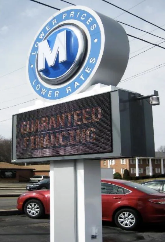
A pylon needs to work as a complete sign structure. The support, overall proportions, tenant hierarchy, panel sizes, illumination, and access for future updates all affect its practical value.
A cabinet sign houses the sign face and its lighting within a fabricated enclosure. The face can carry a logo, lettering, and supporting graphics. Cabinet shape, face construction, and lighting should be considered together.
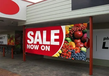
A hanging banner, an applied window graphic, and an interior wall display need different materials and finishing. Start with where the message will live, how it will attach, and when it needs to come down or change.